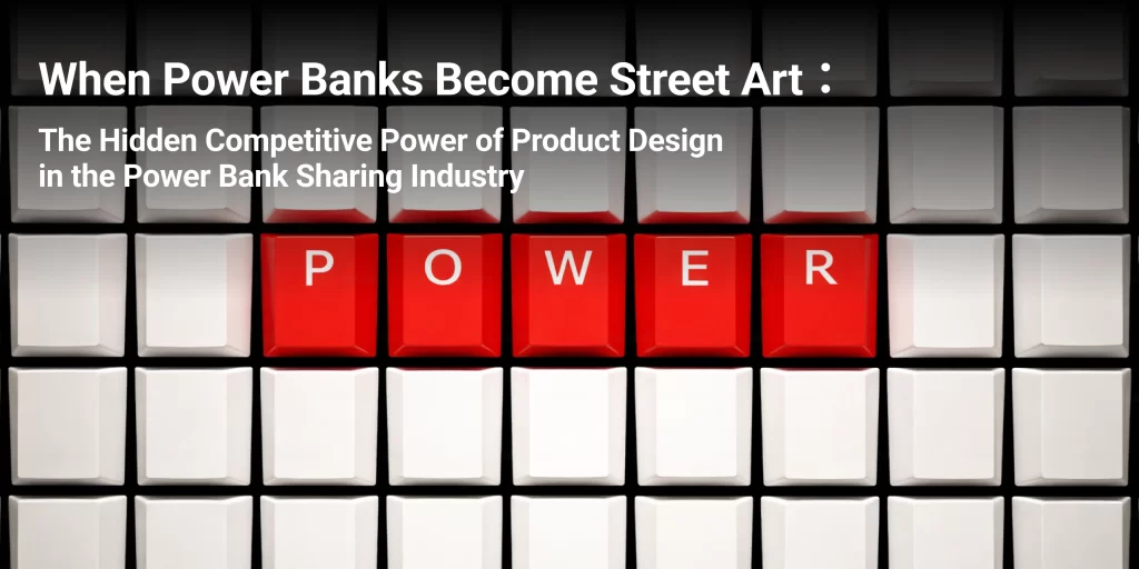
Introduction
Have you ever noticed something interesting when your phone battery turns red and you start looking for a power bank in a shopping mall.
What catches your eye first? Is it the brand logo?
Usually not. It’s the color, the shape, and the visual signal that stands out among dozens of commercial signs.
Recently, a piece of news shook the industry: a leading Chinese brand filed legal complaints against several competitors for allegedly imitating its distinctive cabinet color scheme. Leaving the legal debate aside, the incident reveals a deeper truth about the shared power bank market:
In an industry that appears highly homogeneous, product design is no longer just about aesthetics—it has become a silent battlefield for brand survival.
Table of Contents
Part 1: Why Great Design Takes So Much Effort
Many clients have asked us the same question:
“Isn’t it just printing a pattern on the power bank and changing the cabinet color? Why does design take so long and cost so much?”
This question reflects one of the most common misunderstandings about product design.
Behind every successful shared power bank design lies three invisible rounds of refinement.
1.1 The Balance Between Comfort and Ergonomics
A power bank is not just something users see — it’s something they hold for 30 minutes or even longer.
- Does the material feel slippery?
- Do the edges feel sharp or uncomfortable?
- Is the weight distribution balanced?
These details directly influence whether a user subconsciously thinks:
“Hmm… this thing feels uncomfortable to hold.”
In real projects, we often create 3–5 prototype versions just to refine the grip curvature, testing them with people who have different hand sizes.
1.2 The Harmony Between Design and Environment
A power bank cabinet rarely exists alone. It usually sits in places like:
- shopping mall corridors
- restaurant entrances
- subway stations
This means the design must interact with its surroundings.
Questions designers must consider include:
- Will the lighting be too harsh at night?
- Will the screen be blocked by passing pedestrians?
- Will the cabinet color visually clash with nearby storefronts?
Good design is not only about looking good on its own, but also about coexisting harmoniously with the physical space around it.
1.3 The Long-Term Test of Time
Design must also survive the real world.
- Will the printed graphics fade after months of use?
- Will the QR code still scan after exposure to sunlight and dust?
- Are the indicator lights visible under different lighting conditions?
These details determine whether the device still feels reliable three months after deployment, or quickly becomes an ignored piece of street equipment.
This is why design takes effort: it’s not about drawing a beautiful product — it’s about anticipating the entire lifecycle of a device, from manufacturing to retirement.
Part 2: What Good Design Can Actually Do
If we move beyond aesthetics and look at business performance and user experience, good design turns out to be a surprisingly powerful tool.
2.1 Increasing Conversion Rates
In many ways, design acts as a silent salesperson.
Psychology describes something called the mere-exposure effect: people naturally trust things that feel familiar and visually comfortable.
When a user urgently needs power and scans the environment for a charging station, the cabinet that looks:
- clean
- well-lit
- visually balanced
will earn trust much faster than one that appears messy or cheap.
That trust quickly translates into a simple action: scanning the QR code and renting the device.
Research on public infrastructure suggests that visual friendliness alone can increase first-time usage intent by more than 30%.
2.2 Reducing Operational Costs
Design can also function as a built-in error prevention system.
One major operational challenge in the shared power bank industry is failed returns. Users may:
- not insert the power bank correctly
- choose the wrong slot
- think the device has been returned when it hasn’t
Thoughtful design can dramatically reduce these problems.
For example:
- return slots with green indicator lights when properly inserted
- subtle “click” feedback confirming correct placement
- clear visual cues for correct orientation
These small design decisions reduce customer service calls and prevent device loss — saving real operational costs.
2.3 Creating Organic Social Exposure
Design can also become free advertising.
Would someone post a photo of a plain white power bank on social media?
Probably not.
But if the power bank features:
- playful illustrations
- trendy graphics
- collaborations with popular IPs
It can suddenly feel like a lifestyle accessory.
When users carry it while shopping, drinking coffee, or commuting, it becomes a moving brand exposure point.
This type of organic visibility often delivers marketing value that traditional ads cannot easily replicate.
Part 3: Design Pitfalls to Avoid
Of course, not all designs succeed. Over the years we’ve observed several common pitfalls in the industry.
Pitfall 1: Prioritizing Style Over Usability
Some designs pursue unique cabinet shapes — even tilted or irregular structures — to look “cool.”
But this can create practical problems:
- users must bend down to scan the code
- inserting or removing devices becomes difficult
The first principle of product design is always usability.
If a design looks impressive but feels inconvenient, it has failed.
Pitfall 2: The “Cheap Reality” Problem
Another common issue occurs when the final product doesn’t match the design concept.
For example:
- metallic gray becomes cheap plastic silver
- matte textures turn into glossy reflective surfaces
Material selection, manufacturing processes, and color calibration are just as important as the design itself. Without careful execution, even the best concept can lose its impact.
Pitfall 3: Overusing Brand Colors
Brand colors are powerful assets. In many cases, a specific color instantly reminds people of a particular company.
However, when a strong color dominates public spaces excessively, it may feel visually aggressive.
Effective brand color usage should be:
- recognizable but not overwhelming
- distinctive but not intrusive
The best designs find a balance between brand identity and the shared aesthetics of public spaces.
Part 4: Can AI Design Power Bank Products?
A hot topic recently is the use of AI tools like Midjourney and Stable Diffusion to create power bank graphics and logos.
Is this practical?
Our view is simple:
AI is an excellent creative partner — but not a reliable design director.
4.1 Where AI Excels
AI tools are:
- fast
- inexpensive
- incredibly imaginative
You can generate dozens of visual concepts in minutes, such as:
- cyberpunk-themed power banks
- traditional ink-painting style designs
For early brainstorming, AI is extremely useful.
4.2 Where AI Falls Short
However, AI has three major limitations.
1. AI does not understand brand strategy
It can generate visually appealing images, but it cannot understand whether your brand identity emphasizes:
- safety
- durability
- warmth
- technology
Maintaining a consistent brand narrative still requires human judgment.
2. Potential copyright risks
AI-generated images may unintentionally resemble existing works. The legal boundaries around AI-generated commercial content remain uncertain.
3. AI does not understand manufacturing
A design that looks great digitally must still face real-world production constraints:
- Can the color actually be printed?
- How will metallic finishes be applied?
- Will reflective materials affect visibility?
These practical questions remain outside AI’s capabilities.
The Best Approach
The most effective workflow today is simple:
Use AI for inspiration.
Use human creativity for direction.
Use craftsmanship for execution.
Conclusion
From disputes over distinctive color schemes to the meticulous refinement of device graphics, the shared power bank industry is quietly evolving.
Product design is no longer just decoration — it is a strategic tool that shapes how users notice, trust, and remember a brand.
At the moment when someone urgently needs power, the device that stands out, feels intuitive, and looks reliable is the one they choose.
And that moment of choice is where thoughtful design truly proves its value.